Philips asked code d’azur to restructure and redesign Professional Oral Care Connect (POCC) their Dental Professionals (DP’s) digital portal. The issue with the existing interface was that it was designed to keep track of marketing analytics and it did not translate to the use case for the DPs. The purpose of the portal is to help the DP’s recommend and sell power toothbrushes to their patients in the hope to convert their patients to power toothbrush users thus improving their oral health. In turn, the digital portal would allow the DP’s to keep track of the power toothbrushes they recommended and the kickbacks they would receive once their patients purchased the items.
POCC
Client: Philips | Role: Lead Digital Designer
The Objective
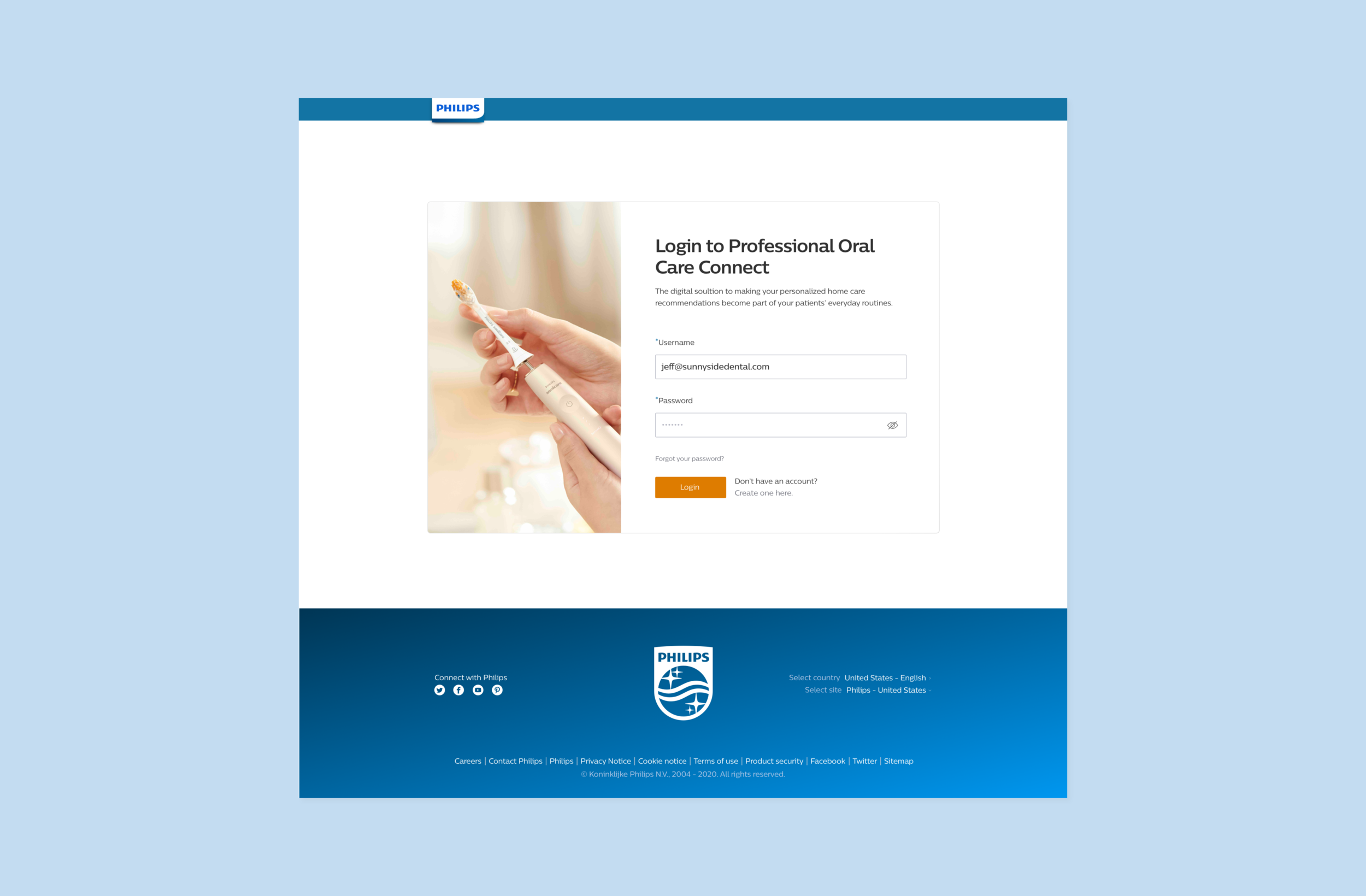
Create an MVP – a single application built atop the Partnerize API, that delivers the features expressed below and presents an informative, easy-to-use interface, for those Dental Professionals participating in the POCC program: 1. Registration Process 2. Login 3. Partnerize Sales Dashboard (Admin & Non-Admin) 4. Chair-side Tool
Image compilation of the original Professional Oral Care Connect interface.
Process & Strategy
The projects timeline was something that was quite tight. UX and UI had only two and a half sprints (5 weeks) to complete this project before handing off to the development team. While at code d’azur the digital designers usually go through the Discover, Define, Create, and Test life cycle, we already had preliminary research done by Philips to inform our project strategy and goals. So it was really more connecting with what desk research/findings they already had, and using best practices to provide a seamless user experience.
Site Map
Initially with the inclusion of the chair-side tool as part of the scope of the project. We had the dashboard design for the DP’s campaign analytics and tracking of sales as a separate design. To keep inline with the design principles of Philips to make the users experience minimalistic and seamless we thought housing both the tracking system and chair-side tool under the umbrella of the dashboard would help to unify the experience for the users.
Design Decisions
As the lead UI/ UX designer on this project. It was my job to immerse myself in the updated visual language coming from our team in Amsterdam. I would work very closely with the design director for the Voyager team to bring her my ideas and gain her opinion on how to use my thoughts to solve the specific problems POCC was facing. I was supposed to have a component library to work with, but the Voyager team was so behind that many components, logic, and brand instructions were not solidified when my project began. I had the newly improved brand tenants to work with and test pages from the Voyager team. Other than that, I had to think of how certain components may function and look best for the task at hand. One example of this was the step indicator tool seen below.
MVP Designs
Jordi Romkema, Managing Director of code d’azur, USA | Marlies Bartels, Freelance Director of Design, AMS | Cody Nash, Producer, ATX | Brittany Crocker, UX Designer | Tina Bozsik, Lead Digital Designer


